

A format-by-format preflight sheet for a fictional Bristol florist; adapt it to the real post and current Instagram controls
| Format or route | Customer needs to know | Check before publishing | If the control is unavailable |
|---|---|---|---|
| Photo or carousel | What the item is and which detail matters | Meaningful description for each informative image; offer facts in caption | Explain missing visual information in normal caption text |
| Reel | What is said and what happens on screen | Correct speech captions; describe key silent actions | Provide a concise written explanation or an accessible alternative route |
| Story | Offer, time and next action before it disappears | Readable contrast and pace; link sticker opens the intended page | Repeat the essential instruction in profile or linked page |
| Profile and destination | How to enquire, order or visit | Plain route, current hours, usable contact option | Offer another clearly described contact path |
| Published post | Same message as the approved draft | Open from a second account or logged-out view; check crop and links | Correct the post or publish a clear correction |
Start with the customer's task, not an accessibility badge
The Bristol florist has a new bouquet available for Saturday collection. A customer needs to know what the bouquet is, whether it can be ordered, when collection is possible and how to ask about a substitution. If those facts exist only as tiny words inside an image, the post fails the practical task for someone who cannot read that image. A beautiful photograph still has a role, but the team should write the customer's essential facts in ordinary text before opening a design tool.
Accessibility is broader than one feature switch. A person may use a screen reader, enlarge text, view without sound, have limited colour vision or simply struggle with a moving Story on a small phone. Another person may understand the post but be unable to use the destination it points to. The florist does not need to predict every customer's device. It can ask whether the message survives when an image, audio track, visual cue or quick-tap route is unavailable.
Plan one message across the formats you actually use
Begin with a short content brief: 'Saturday bouquet collection: show the arrangement, explain the flowers may vary, give the order cut-off and point to the correct enquiry route.' Keep that sentence beside the draft. A still image might show the size and colours, a carousel might show the front and side, a Reel might demonstrate wrapping, and a Story might remind people about the cut-off. These are different treatments of one customer question, not instructions to publish every format.
Now identify what disappears in each treatment. A photograph cannot speak its own colour or size to someone who does not see it. A spoken Reel may be unintelligible with sound muted. A Story's brief overlay may disappear before a reader finishes it. A link sticker may open a generic homepage rather than the bouquet order page. The table below gives the reviewer a way to list the necessary information, the control to check and a fallback when a format cannot carry it reliably.
- Name the exact customer question and the one next action the post should support.
- Write the indispensable information as ordinary text before designing a visual.
- Choose the photo, Reel or Story for a real reason and plan an alternative for information that the format hides.
Describe informative photos for the person who cannot see them
For the florist's hero photograph, useful alt text might be: 'Hand-tied bouquet with coral roses, purple hydrangeas and yellow filler flowers in a clear glass vase.' It says what makes the image relevant to the offer. 'Beautiful flowers' omits the distinctive content; a list of repeated sales keywords interrupts a screen reader without helping a buyer. If the actual stems change before publication, update the description. The description must be true to the final image, not to the first draft.
Instagram's accessibility announcement introduced custom photo descriptions alongside automatic ones; Meta's 2021 explanation of automatic alt text is useful background, not a current map of every app control. An automated description can miss an arrangement's meaningful detail, so the florist should check the available manual field when preparing an informative photo. Instagram's labels and routes can change. Use the current app controls and the separate HitsBoost alt-text guide for tap-by-tap help. For a carousel, review each informative frame separately rather than pasting the same sentence onto a bouquet, a size comparison and a collection-point photograph.
Decide what the image contributes before writing. A decorative pattern needs no long narration, while a chart, price card or instructional image needs its important information available in ordinary text. W3C's image tutorial distinguishes informative, decorative and complex images by purpose. Instagram may not expose every control for every format; do not pretend that a manual field exists everywhere. When a format lacks it, include the missing fact in the visible caption or a linked page that a customer can actually use.
Keep offer facts out of tiny picture-only text
A social graphic can make 'Saturday collection' look attractive, but the day, cut-off and order instruction should also appear as ordinary post text. W3C explains that real text can resize and adapt more reliably than words baked into pixels. The florist can retain a short visual headline while putting the full collection window and substitution note in the caption and linked order page. This helps a person who enlarges text and a person whose image does not load.
Use a clear opening line that names the offer without a wall of tags or emoji. Then give the action in a complete sentence: 'Ask us about Saturday collection through the link in our profile before the stated cut-off.' That sentence needs a real cut-off and a tested destination before publishing. Do not let an old template supply the date. If the shop cannot guarantee a particular flower, avoid saying the photographed arrangement is the exact product every customer will receive.
Plain writing also matters in the route itself. A label such as 'Ask about Saturday bouquets' is easier to understand than 'tap here', and an enquiry page should say what information to provide and when staff respond. Hashtags and location tags can still be used when relevant, but they are not substitutes for a readable offer. Accessibility checks must preserve business accuracy: clearer text cannot fix an unavailable item, wrong opening hours or an unstaffed inbox.
Make a Reel understandable with sound off and eyes away
The florist films a short Reel of wrapping the Saturday bouquet. First play it muted from start to finish. A viewer should be able to understand spoken instructions through correctly timed captions and see the important action without captions covering the hands, flowers or final result. The inline image shows a colleague checking caption bars during a wrapping demonstration. It illustrates a review habit, not Instagram's exact interface or a guaranteed way to place captions in the current app.
Automatic transcription is a starting point. Read every line against the actual speech, especially flower names, collection times, prices, the shop name and accents the software may mishear. Correct the transcript where the available control allows it. If the editor cannot produce reliable captions, prepare an alternative version or put a concise account of the spoken information in the post text. W3C advises captions for meaningful speech and non-speech audio; a 'music playing' label may matter when music carries a cue rather than merely fills the background.
Now listen without looking. If the Reel silently points to a doorway, holds up a cut-off card or changes between two bouquet sizes without saying so, add a brief spoken description where possible or explain the action in the caption. A transcript of words alone cannot convey a critical visual choice. The HitsBoost Reel-caption guide covers the separate feature controls. This workflow asks whether the finished video, not just a toggle, lets a customer understand the useful information through more than one route.

Give Stories enough time and a reliable destination
A Story is tempting for a last-minute collection reminder because it feels immediate. That urgency makes the review more important. Keep the main instruction short enough to read on a phone and hold the frame long enough for a person to understand it. Put text over a calm, high-contrast background rather than across busy petals. Avoid using a red badge as the only way to mark that collection closes today; write the closing information explicitly.
If the Story includes speech, inspect the current caption or sticker options for the account and check their output against the recording. Instagram's sticker help describes the available controls, which can move or differ across accounts and devices. Do not assume the published sticker's automatic words are correct because the editing preview looked plausible. A Story with no speech may still need a written description of what visually changes if that change carries the offer.
Open the link sticker after publication on a phone. It should reach the specific current bouquet or enquiry destination, with the same collection window and a readable contact path. If that destination is not ready, publish a profile route or a plain enquiry instruction that is accurate now. The separate Story-link guide explains the mechanics. The access decision here is broader: someone who misses the Story's few seconds should still be able to find the same essential information on a stable page or profile route.
Check contrast, motion and words at phone size
Design on a large monitor, but approve on a small phone. Text that looks spacious at desktop width can shrink into a blur over a photograph. W3C's contrast guidance gives a 4.5:1 minimum for normal text and 3:1 for large text in WCAG 2.1 AA. Those are useful design targets for a deliberately placed overlay, not proof that the entire Instagram post or business meets a legal standard. Test the actual overlay against its changing background, not only the brand palette sheet.
Place dark text on a light solid panel, or light text on a dark solid panel, when a photo is too complex. Increase size and spacing before adding shadows that still leave a word hard to read. Read the card under ordinary room light and outdoors. If the message survives only when a customer zooms or pauses perfectly, simplify it. Put the precise price, date or safety detail into caption text even if it also appears on screen.
- Read overlay text at the size of an ordinary phone, outdoors and with brightness reduced.
- Use light-dark contrast and a solid backing where text crosses a busy photograph.
- Do not use colour, an emoji or flashing movement as the only carrier of an instruction.
Make the next customer step usable
A post can pass every visual check and fail at the handoff. If a customer reaches the florist's profile and sees several unlabeled links, an outdated telephone number or a message inbox that nobody monitors, the accessible post has led to a dead end. Decide which action is real: enquire about availability, place an order, book a collection slot or visit the shop. Then make that action obvious in ordinary words and verify the public destination from a phone that is not signed into the business account.
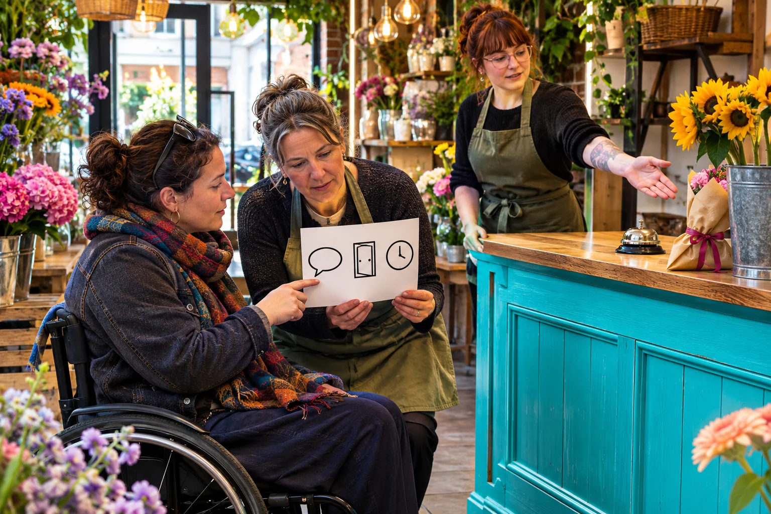
The second inline image shows a customer and staff member checking a simple contact, entrance and time card. The practical version is to review the real order page, contact option, collection address and hours. A customer who cannot use a DM-only route may need a website form, chat, telephone or other appropriate option that the business actually supports. Do not promise a channel is staffed around the clock unless it is. If collection access information matters, ask the shop to state it accurately on its current public page rather than forcing customers to infer it from a photograph.
Test the route with a colleague who did not write the post. Ask them what the bouquet costs, how to ask about substitutions and where to collect it. Notice where they stop or guess. The UK enquiry handoff guide covers staff ownership and response steps; the booking-link guide covers a service appointment path. This accessibility check is about the continuity between the social message and a usable customer choice. The shop should correct the route before it asks more people to follow it.
Work through a Saturday bouquet example
Suppose the fictional florist has a mixed bouquet that can be requested for Saturday collection. The first draft is a carousel: a front photograph, a side photograph and a tiny graphic reading 'collect 10–2'. The owner writes the real offer in a working brief, checks the shop's actual Saturday hours and confirms whether the pictured stems can vary. The public caption then names the collection day, gives the verified time window and points to a specific enquiry page. The image remains attractive, but it is no longer the only source of the time.
For the front photograph, the editor describes the arrangement's most useful visible traits. For the side photograph, the description adds the wrapping and approximate shape rather than repeating the first line. The third graphic either becomes ordinary caption text or gets a description containing its exact information. A staff member opens the carousel on a phone, reviews the order of the frames and confirms that none of the details is cropped out. If the app does not offer the expected description control for the chosen publishing path, the team puts the information in the visible text and records the limitation.
A companion Reel shows the wrapping process. The reviewer plays it muted, corrects any speech caption that misstates the collection time, then listens without looking to find visual instructions that need explanation. Finally, a short Story links to the live enquiry page; a colleague tests that link after publication. This is a hypothetical workflow, not a real campaign or evidence that accessible content increases orders. Its value is that each review catches a different failure before a customer has to report it.
Run a five-minute preflight, then inspect the public result
A small team needs a review that survives a busy Saturday. Give one person responsibility for the offer facts and another for the access check. The second person should not rely on the editor's explanations; they should see the planned public post. Ask them to state the offer, next action and key visual information using only the caption, then using the full post. If the two versions disagree, revise. This simple comparison catches missing image descriptions, tiny-only terms and captions that repeat the wrong date.
Use the table as a preflight. For photos, confirm descriptions match the actual final images. For Reels, check a muted run and a listening-only run; correct captions and the explanation of important visual actions. For Stories, inspect contrast, dwell time and the destination. For the profile or linked page, confirm the action can be completed and that staff know how to answer. Keep the checklist short enough that the team will actually use it, and expand it when a recurring error appears.
After publishing, open the post from a separate account or logged-out route where available. The live crop, sticker, captions and link can differ from the draft preview. If the team finds a material error, use the current edit controls to correct it, or publish a clear correction and update the destination. Do not hide a wrong cut-off in an ephemeral comment that future customers may miss. Record the correction owner and date so the same old creative is not scheduled again. A public post, not an approval screenshot, is the final thing customers encounter.
- Ask a second person to understand the draft without seeing the planning notes.
- Watch video muted, then listen without watching and compare both with the written post.
- Open the published post and destination on a phone outside the editing account.
- Record the correction owner and check that the correction is visible publicly.
Keep accessibility and follower services as separate decisions
The florist can learn from questions that reach its public inbox. If several customers ask how to collect, the post or destination may be unclear; revise the route. If a screen-reader user reports that an image description misses a key detail, correct the description and add the detail to the visible text where appropriate. Use customer feedback as evidence about the actual experience, without asking people to disclose disabilities or treating one person's experience as a complete audit of every device.
HitsBoost's UK Instagram follower packages are a separate profile-count service with current terms on the live service page. A purchase does not make a post accessible and cannot guarantee reach, engagement, enquiries, orders or sales. If the owner wants to compare that service, review the UK page separately while keeping the accessibility preflight for all content, paid or organic. The durable improvement is the team's ability to say what each post communicates, what a customer can do next and what it will fix when the public version falls short.
Frequently asked questions
What makes an Instagram post accessible for a small UK business?+
A customer should be able to understand the key information and next action when a picture, audio track or quick visual cue is unavailable. Use meaningful descriptions for informative photos, accurate captions for speech, readable text and a tested customer route. Check the final public post, not only the draft.
Does Instagram automatically write alt text for photos?+
Meta describes automatic alt text for Facebook and Instagram, but its generated wording may miss the detail relevant to a particular offer. Review the final image and use the manual description control where the current Instagram publishing route offers it. Put essential facts in ordinary post text too.
Should every photograph in a carousel have the same description?+
No. Describe each informative frame for the purpose it serves. A front view, a size comparison and a collection entrance convey different information. If a frame is purely decorative, avoid making a screen-reader user listen to an unnecessary sales sentence.
Are automatic Reel captions enough?+
Treat them as a draft. Check the finished captions against every spoken word and relevant sound, especially names, times and prices. Correct errors where the current editor allows it, and make important visual actions understandable through speech or written explanation.
Can I rely on words placed inside a Story image?+
That is risky when the words are small, low contrast or visible only briefly. Put essential terms in readable text and on a stable destination. Test the actual Story at phone size and open its link after publishing.
Do UK accessibility laws require every business Instagram post to pass this checklist?+
This is practical editorial guidance, not a legal ruling. Duties can depend on the service and facts. W3C and UK public-sector resources support the communication principles, but a business with a specific legal question should get advice suited to its circumstances.
What if Instagram does not offer alt text or captions for my format?+
Do not invent a control. State the missing visual or spoken information in the ordinary caption, Story text or linked page, and choose a different format or accessible alternative when the missing information is essential. Check Instagram's current Help Centre because controls change.
Will accessible posts or bought followers increase my sales?+
Neither is a sales guarantee. Accessibility work helps more people understand a message and use its customer route; results still depend on the offer, audience and business operation. A follower package changes a profile-count service under its own terms and does not guarantee relevant customers, reach, enquiries or orders.
Compare Instagram Followers packages.
Prepare the public destination, then review the quantity and terms that fit your goal.
Review UK Instagram follower options separately